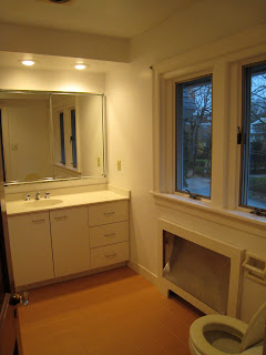
I love looking and before and after photos to remind yourself how much things really have changed. I recently went back through my files and found some amazing shots of my house and the renovations which have been ongoing here for the last several years.
We purchased our c. 1910 home knowing that a full head to toe renovation was in the cards for us once we moved in. Despite the fact that my boys were very young at the time and life was busy, it was thrilling for me to be able to sink my teeth into a fantastic design project on a historical home and one where the design could really reflect everything that I love.
In partnership with my builder (J. Schwartz Construction) and architect (JFA Architecture), we came up with a plan for a complete overhaul and expansion of the outdated kitchen and the addition of a family room and the addition of a family-friendly mudroom and powder room which ran along the entire backside of the house. Here are some of the "before" shots:
 |
| A small cooktop area, the pantry, and the back staircase |
 |
A tiny powder room sat to the right of the fridge. It was so small that you could sit
on the toilet and easily reach the sink to wash your hands! |
 |
This was the small eat in kitchen - only three could fit
at once and we ate in "shifts" with our kids |
 |
| The little breakfast room is behind the half wall |
Here is the Living Room before. Remember, the house had no family room at all so this functioned as both family and living room. All furniture is from the prior owner - took these shots during our final walk-through!
 |
| Right bookshelf ultimately removed in renovatin |
 |
| Looking towards the street |
 |
This is a view from dining room into butler's pantry.
The doorway was expanded and this is now the new kitchen pantry. |
The renovation was extensive and took nearly 10 months to complete. I can always sympathize with my clients who are living through a renovation since I have "been there and done that", but ultimately the oversight that this provided me was well worth the hassle (and dust!).
My focus was on the design and overall interior flow and orientation, making this new space work for our family down to every last little detail. I selected all of the finishes (paint, countertops, backsplash, cabinets), appliances, and handled design and sourcing of the critical interior details which give our house real soul such as the reclaimed wood beams in the family room, the custom designed copper island, and the honed, locally-sourced slate floors.
Here are a few of my (non professional) shots of the living room showing the new furniture, finishes (white trim!) and the new entry into the family room.
 |
Good view of the new entry to the family room for
a totally circular flow of traffic through the house |
 |
A game table and chairs will eventually
be placed at the front bay windows |
Here are a few shots of the kitchen after. Please excuse the darkness of the pictures - again, not professionally shot or staged! Some of my favorite features are the custom copper island, the indestructible slate floor (go ahead kids and dog, just try to destroy it!), and the vaulted ceilings in the breakfast room - a big improvement from our three seater table.
 |
| Good view of the 12 x 12 slate floor tiles |
 |
Formerly the old butler's pantry, this is now a new
pantry area, broom closet, and integrated fridge |
 |
Another view showing the new widened
opening to the dining room for easy flow |
 |
This gives a good sense of the height
and sense of openness in the breakfast area |
 |
New powder room. The stone is from the
original exterior of the house. |
 |
Decorative shelves flanking the powder
room with pocket door on other side of mudroom |
 |
The family room is on the other side
of the mudroom/powder room area |
 |
This room also has 15' ceilings and
reclaimed barnwood beams, one of my
favorite elements in the room |
 |
This is the original exterior fireplace wall.
Apologies for the glare! |
 |
| The large closet holds the kids' games and toys |
Hope your enjoyed the tour through the Llanfair renovation. It was a true labor of love and the best reflection of Elements' design aesthetic that I could possibly show.


